Saturday, November 22, 2008


Performance Art Piece

For my performance art piece, I painted using blacklight paint. Before class I painted on the back "Technology Reveals Art" and during the performance in class I painted a quick picture of flowers. The paint I used was blacklight paint so it didn't really show up in normal light. When I was done painting we went into a dark room and turned the blacklight on and showed the picture, then I flipped it over to the back and showed the saying on the back. Overall I liked doing this project, and I really enjoyed watching everybody else's performances.

Saturday, November 8, 2008

Xerox Project


Xerox project


For my xerox project i chose to make some sort of creature, in the center i put a picture of my face then did my chest, and arms. I attached my feet to the ends of my arms which made it look very strange. I then xeroxed my hands in different positions and put them coming out of my hear and at the bottom of the page. I then xeroxed some of my jewelry and some things that I had with me, such as keys and some change just to add some smaller details into the picture. Overall I really like how it turned out, although it was kind of embarrassing sticking my head into the machine!

Xerox Project Comments:

Taylor: I really liked that you did your project on mirror, it turned out really nice and the fact that you colored the flowers made it really pretty.
Adam: your idea of actually reconstructing an art piece was really unique, it turned out great!
Makayla: I really liked your overall concept, and the fact that you put a quote on their and the money, it was really creative.
Murad: yours turned out really nice, i liked the henna inspired details you added wo it.
Colleen: i really liked the message that yours portrayed, and the fact that you put it on brightly colored paper.
Perry: i liked your idea of making a weird creature using your arms and legs, it turned out really good.
Ryan: putting the xerox copies onto a lamp was a really good idea, the layers it created made it look really good when the light was on, and looked completely different when it was off.
Bernadette: i think yours turned out really pretty, and liked you idea of putting different words into the collage as well.
Ashley: yours was really good, i like that you did all different parts of your body, even your name tag, and it was funny that you had yourself smiling in the xerox copies as well.
Mathew: i liked that you put your in a box instead of just on a poster board, and i liked that you moved your hands made the prints really creative.
Laura: i liked that you just used your hands to create the shape of a dragon, it was exactly like doing shadow puppets!
Shawn: i like that yours showed lots of movement, and the fact that you put it on a red and black background made it stand out alot!
Stacy: i liked the quote that you put on it and the fact that you made it into the shape of a butterfly, it turned out really pretty.
Victor: I like that you scanned pretty much all parts of your body, nobody else did as much as you, it was really nice.
John: i like that you did it with your eyes open, it turned out really cool and the fact that you faded yours from black to white, it turned out really nice.

Thursday, October 23, 2008

grid art project comments

Grid Art Project comments:
I think overall everyones project turned out really well, it was interesting to see what people came up with, and they were all very creative.

Victor: I really liked your idea of putting pacman on a frying pan grid, your use of the frying pan was really creative!
Colleen: The eye idea was very pretty, I liked how you showed it normal first, then with the grid on it.
Taylor: Your reflecting grids were really inventive, it made everything in the mirror into a grid, it looked really nice!
Makayla: I really liked your idea of putting it onto a lamp shade, it must be really cool looking when the light is on as well.
Ryan: I could kind of see how yours way a grid, seeing as how pacman is on a grid, yours was just sideways.
John: I loved your giraffe out of coffee, it was really different from the rest!
Perri: I really liked the bright colors you used to stick in your grid, it was very pretty.
Stacy: Yours looked like it took forever, it turned out really bright and pretty.
Bernadette: Yours turned out very bright and pretty, I liked how you used the beads to make the actual grid.
Matt: I really liked that your made your grid on a door, it was very unique.
Adam: Your project was very good, I like that you used Christmas lights to light different parts of your grid.
Murad: I liked that you used table mats with an existing grid, it was something no one else did.
Shawn: I really liked that you did yours on a chess board, it turned out very nice.
Brenden: The picture of the wave turned out very nice, great job!

Sunday, October 19, 2008

Grid Art Project

Here is a picture of my final grid project. I got a cardboard poster and created a grid with thumbtacks, i then used rubber bands to make a flower. The picture does not really do it justice and it looks a lot better when you actually see it in person. I enjoyed this project and liked to see everyones ideas, it was really interesting to see everybodys interpretation of "grid art".

Flipbook Animations

I'm a little behind on my posts, due to some technical difficulties and the fact that I could not remember my user name or password until now. In class we had a project where we had to make a 200 page flipbook animation. I love flowers so of course I chose to do a flower growing. I started with a seed on the ground, I then made the flower stem start growing and swirling around then the flower growing. I also made a sun rising behind the flower. The flower grew larger and larger, then as I made the sun setting it became smaller until it eventually died and went back into the seed. The overall process of creating the flipbook was very tedious. But I am very proud of the overall product. After seeing everybody else's projects I was very impressed. I would post some pictures of it but naturally my camera is not working now either!

Sunday, September 28, 2008

Wired Nextfest 2008 Exhibits


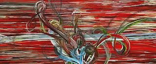
I really like the exhibit Art of Play by Erik Natzke. His use of flash is also really creative and something that you don't usually see. His works are really abstract and show a lot of movemet, and its amazing to see the whole process he does and the finished project. If you look at his photostream on flickr it shows all of his works. My favorite one is called "Trbt" which is the one i posted above. I love the colors and movement it shows.

Brainball is another exhibit that I find really interesting. I've never heard o something that can detect brainwaves and stress. To play the game you need two players, the players sit across each other at a table with a ball between them. The headbands monitor stress, and the computer that the stress data is sent to controls the ball, and directs it away from the stress. So whichever player has the least stress the ball then rolls away from. I think its a really creative to turn it into a game.

The ckBot from the University of Pennsylvania was another one of my favorites. The robot can be broken into pieces and it will reassemble itself back together using infrared and cameras. It seems kind of creepy, as if it had a mind of its own but I think its amazing that they have the technology to create a robot that can even put itself back together.


The erasable paper is another brilliant idea, not only will it reduce the amount of paper that will have to be recycled, but it will also help people use less because you can just reuse the paper that you don't need anymore. I am wondering how much more it will cost to create this paper though.

Monday, September 15, 2008

the importance of music

The real time music in the blacksmith movie scene was important and used because it showed the type of music and the technology available at the time that the film was created. It was important because it was the first movie to ever add sound.